How many times in the last 18 months have you heard the line spouted that the Covid vaccine lowers your chance of becoming unwell enough to be hospitalised? Or will you be less likely to catch the coof in the first place?
Before anyone has a conniption and feels compelled to yell MISINFORMATION! let’s take a look at the Ministry of Health’s OWN data.
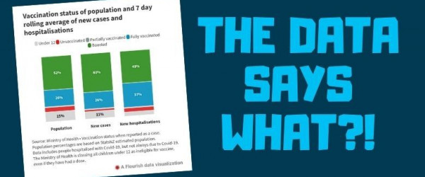
There are a running tally of 7-day averages being published by RNZ. It’s worth a visit. There you will find charts like this one.
This chart displays the percentages of people who have (or haven’t) been vaccinated and how many doses they’ve received.
It also shows the same breakdown for the case numbers by vax status and the hospitalisation rates as well.
We have been told since late 2020 that this product is 95% effective.
The actual trial results quickly morphed into something different that was then promoted by the media and our government officials at every opportunity – day and night on TV, radio, internet, newspapers, text messages, emails, phone calls, magazines, posters, billboards, flyers, and from medical professionals, scientists, politicians, so-called ‘experts’, influencers, and anyone with a ‘professional’ role or a mouth in their face. It was inescapable, feverish, and well past the threshold of obsessive.
We were told that:
❌️ The vaccines were safe and EFFECTIVE.
❌️ The vaccines would prevent sickness, hospitalisation, and death. (Remember that gem of a press conference, Jacinda, where you said “you won’t get sick and you won’t DIE”? We do).
❌️ The vaccines would protect those who got them as this was a ‘Pandemic of the Unvaccinated’ dont you know!
❌️ The unvaccinated would be a threat to the vulnerable and society as a whole; clogging hospitals and spreading disease… They needed to be silenced, shamed, and shunned.
Now, let’s look at the data. The facts. What actually happened.
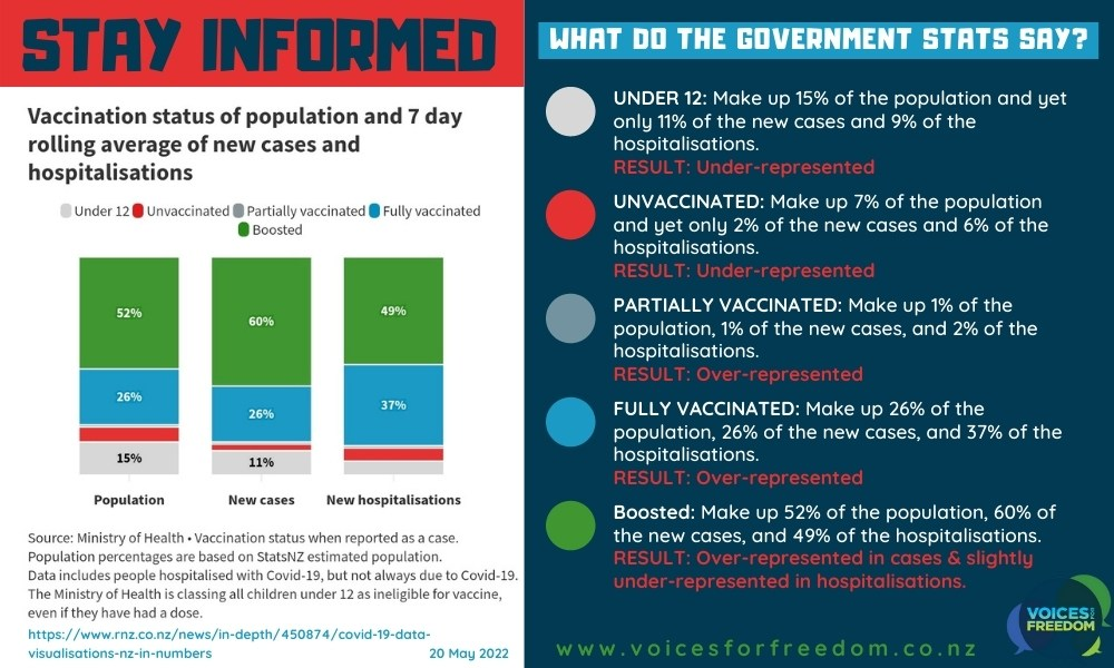
Their OWN data shows that the vaccine-free make up 7% of the population, but only 2% of the new cases, and 6% hospitalisations. That ‘dangerous’ group is UNDER-REPRESENTED in both the case and hospitalisation stats. Awkward.
Moving on to the fully vaccinated crew. The twice-jabbed comprise 26% of the population, 26% of the new cases, and 37% of the hospitalisations. They are OVER-REPRESENTED in one of the most serious categories – being hospitalised. They are, in fact, MORE LIKELY to land in the hospital than those without a jab. Uh oh.
Then there’s this graph.
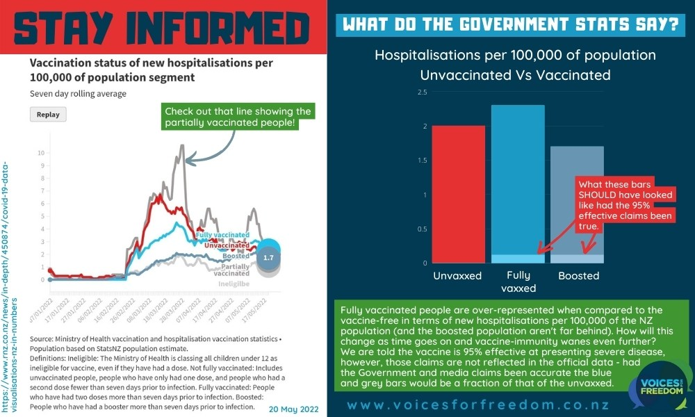
It shows the rates of hospitalisation per 100,000 people in the population. In this data we can compare how many people from each of the groups (Under 12/Ineligible, Unvaccinated, Partially Vaccinated, Fully Vaccinated, and Boosted) ended up in hospital.
Again, it is clear from the data that the fully vaccinated are ahead of the race (and not in a good way) with 2.3 cases per 100,000 compared to 2 per 100,000 in the unvaccinated.
If the 95% effective claims were correct, the bars showing the fully vaxxed and boosted people should be near pancake-level; a small fraction of what they actually are – around 5% of the unvaccinated group.
But they’re not and you’re not being told about it.
Instead, we are still being bombarded with messaging to get shot up with more, and more, and more ineffective products.
Where is the mainstream media on this? It would appear they’re too busy shouting mis- and disinformation at anyone trying to sound the alarm and shine a light on the facts – just like they have the whole way along. Shame. On. Them.
What will these charts look like in the months to come as the narrow ‘immunity’ conferred by the vaccine wanes even further?
How much negative efficacy or increased risk will we see? When will the unintended consequences become so obvious that they can no longer be swept under the rug?
All we can do is watch, wait, and share information like this in the hope to inform those still thinking that more is best.
Stand up. Speak out. Be on the right side of history.
REFERENCE: https://www.rnz.co.nz/news/in-depth/450874/covid-19-data-visualisations-nz-in-numbers
Thanks for reading and sharing! Remember to sign up to our mailing list to keep up with the latest news.
If you value what we are up to at Voices and would like to support our ongoing work you can donate and support our nationwide public education campaigns (webinars, flyers, billboards...) and other initiatives to speak up and push back for your freedoms.