
Alia Bland
“Dangerous, misinformation-spreading loons.”
Our organisation is regularly on the receiving end of these kinds of labels.
But what happens when the information we are “spreading” is their own?
Namely, data and charts from a publicly respected national mainstream media source?
In the past, sharing inconvenient research, data and stats saw us de-platformed from social media sites like Facebook and YouTube.
Thou shalt not share problematic truths.
Disappearing data
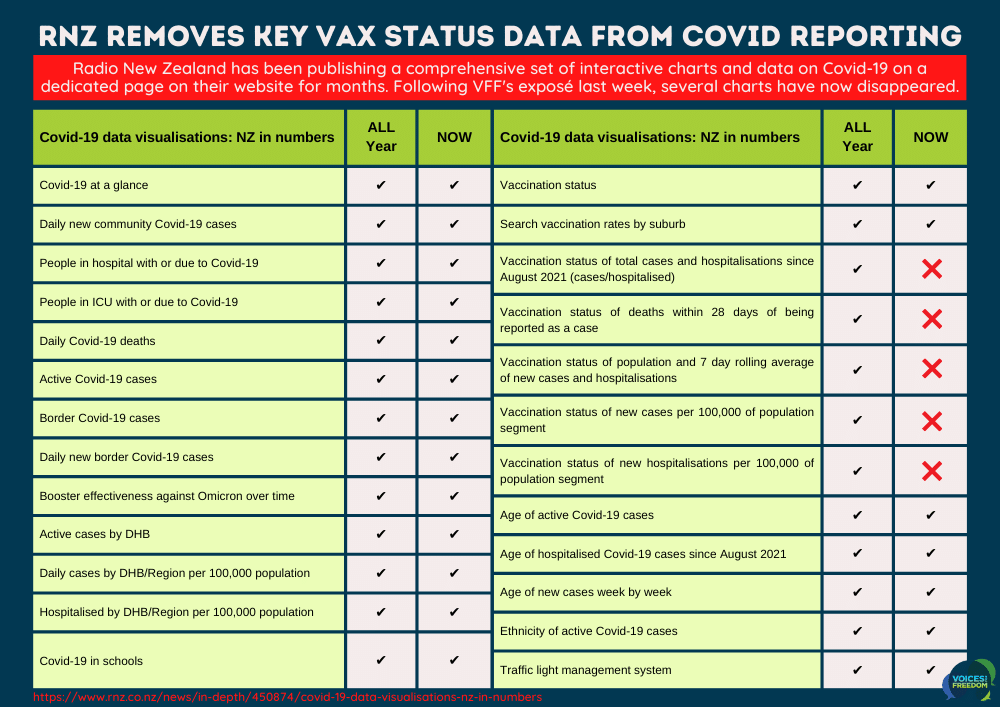
On Friday, I wrote a post about several key Covid-19 cases and hospitalisation charts published on the Radio New Zealand (RNZ) website.
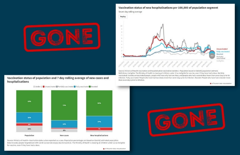
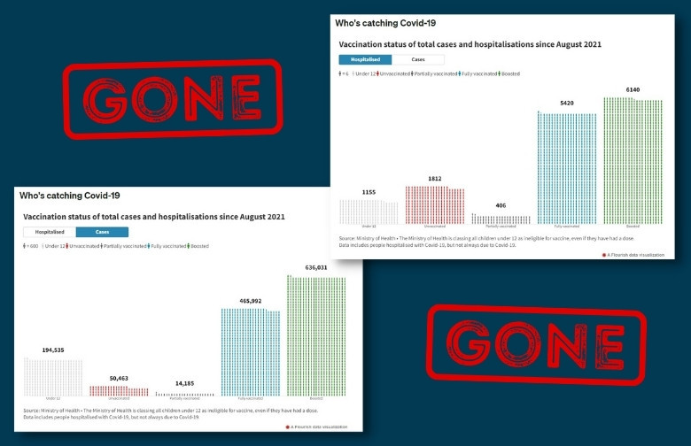
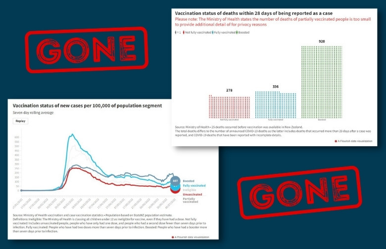
These charts were derived from Ministry of Health numbers and looked at the data surrounding the vaccination status of the recent Covid-19 cases, hospitalisations, and deaths.
In a nutshell, it showed that the boosted make up more than their fair share of the percentages, especially when it comes to being hospitalised or worse.
Awkward.
Last year, when too many people discovered similar patterns of infection and hospitalisation amongst the vaccinated in the UK (via their regular Public Health England Technical Briefing Reports), they officially changed how they shared their information to obscure and omit uncomfortable findings.
It seems our very own national broadcaster has opted for the same strategy in NZ.
Or, perhaps it’s the Ministry of Health playing with the type of data it makes available?
Either way, RNZ has pulled five charts displaying data relating to vaccination status from their webpage – within a day or two of us highlighting the results.
Coincidence? Perhaps. But after many months of regularly updating and displaying this information for the public’s benefit, the timing of this deletion is undoubtedly curious.
So, what should we do about it?
While RNZ is under no obligation to publish this information, we think they have until now been providing a public service to the people of NZ with these easy-to-read charts.
We hear much about transparency and the importance of people accessing accurate information from trusted sources. So, let’s hold them to it!
If, like us, you’re deeply concerned about the removal of information from this public space, then consider letting RNZ know.
Write to them and ask:
- Where have these charts gone?
- Why were they removed?
- When can we expect to see them reinstated?
- And why have the mainstream media not highlighted the results in their reporting?
You can copy and paste my example into an email (and ideally modify it a bit to make you’re own if you have time):
EXAMPLE EMAIL:
I am writing regarding the removal of five charts from your ‘Covid-19 data visualisations: NZ in numbers’ page.
Last week, your page ( https://www.rnz.co.nz/news/in-depth/450874/covid-19-data-visualisations-nz-in-numbers ) displayed charts showing Covid-19 data relating to vaccination status, cases, hospitalisations, deaths, and rates per 100,000 population:
- ‘Vaccination status of total cases and hospitalisations since August 2021’
- ‘Vaccination status of deaths within 28 days of being reported as a case’
- ‘Vaccination status of population and 7 day rolling average of new cases and hospitalisations’
- ‘Vaccination status of new cases per 100,000 of population segment’
- ‘Vaccination status of new hospitalisations per 100,000 of population segment’
- Is it the role of RNZ to censor uncomfortable information? Or should the facts be presented as they stand?
Do the public of NZ require babysitting and shielding from the facts, or can they be trusted to make up their own minds as adults?
I would be interested in understanding the decision to remove this data more fully. Specifically:
- Why have these charts been removed?
- Who ordered the removal?
- When can we expect them to be reinstated?
- Where else can people find this data if it is no longer on the dedicated RNZ page?
- If there has been a change in the data coming from the Ministry of Health, why was there not an explanatory note published on the webpage?
- When we can expect RNZ to publish articles on the fact that the boosted population are over-represented in case, hospitalisation, and death statistics.
I look forward to your reply.
Regards,
[YOUR NAME]
You can find contact details for RNZ here: https://www.rnz.co.nz/about/contact
Let’s fill their inbox with polite yet pressing requests for transparency!
EDIT: There is now a new statement on the RNZ page under the ‘Who’s catching Covid’ heading…
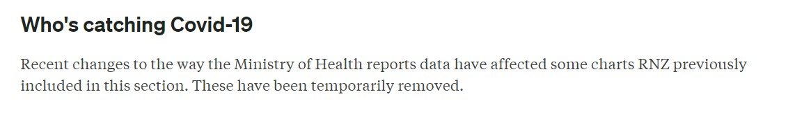 There’s something to be said for people-power! How temporary this removal will be remains to be seen but we shall keep our eyes on any developments. Next up: the Ministry of Health!
REFERENCE: https://www.rnz.co.nz/news/in-depth/450874/covid-19-data-visualisations-nz-in-numbers
Thanks for reading and sharing! Remember to sign up to our mailing list to keep up with the latest news.
If you value what we are up to at Voices and would like to support our ongoing work you can donate and support our nationwide public education campaigns (webinars, flyers, billboards...) and other initiatives to speak up and push back for your freedoms.